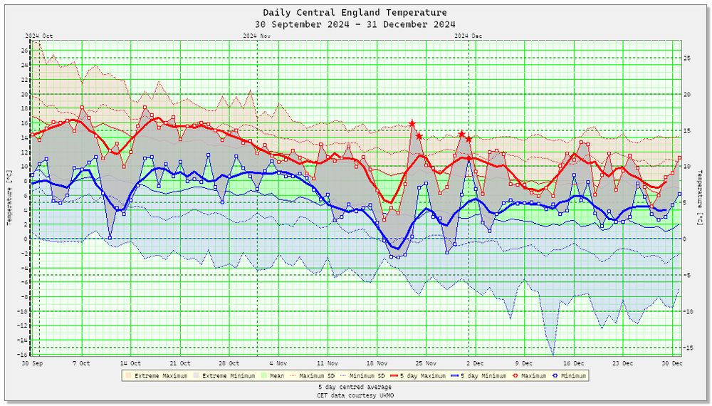
The mean temperature for October 2024 in central England was 11.5°C, making it +0.7°C warmer than the 1991-2020 LTALTALong Term Average. This is usually defined as a 30 year period by the WMO.. The month was marked by a short cold spell from the 10th to the 14th, after that temperatures were generally several degrees above the LTA.
I wrote some code a long while ago now that correlated temperatures in the Central England with the corresponding weather type from the objective Lamb Weather Type series. I compared just the six pure types, anticyclonic, cyclonic, northerly, easterly, southerly and westerly. The application allows you to correlate using the mean, maximum or minimum temperatures with the LWTLWTLamb Weather Types are often used in UK-based analyses, with individual weather patterns based on the eight primary cardinal directions (N, NE, E, SE, S, SW, W, NW) plus cyclonic (C), anticyclonic (A) and unclassified (U) types. on that day. I may have published these charts in a previous blog but I forget, so here they are again 😉
Cyclonic types, whatever the time of years generally seem to be associated with colder anomalies.
Mean temperatures in anticyclonic types are generally only warmer in the months of June or July, otherwise they are invariably colder. See below for charts of maximum and minimum CETs.
As you would expect northerly LWT types always produce colder mean temperatures in central England.
Not surprisingly E types are much colder from October to May, but a little warmer in the extended summer months.
Southerly types are warmer from around April till the end of October, otherwise they produce lower than average mean temperatures.
Westerly types in contrast to N, S, and E types are usually a little colder in the summer, from mid-April to the start of October, in winter they are nearly always milder.
Above are charts for mean maximum and mean minimum temperatures for anticyclonic types, the results of which are a little surprising to me, in that the maximum correlation in summer months is much lower than I imagined it would be, because of course you naturally assume the A type, must be the one favoured for many of the very warm spells in summer. I calculated all the anomalies in the correlations using the 1878-2023 long-term averages, which I thought was the fairest way of doing things, but maybe I was wrong. Perhaps if I revisit this code again I’ll add the frequency each weather type occurs. 😜
The mean temperature of 14.0°C made it the coldest since 2020, and 0.2°C below the 1991-2020 LTALTALong Term Average. This is usually defined as a 30 year period by the WMO.. This was the third below average month in 2024 so far in central England, in a year which globally almost certainly will be the warmest on record.
I noticed recently that the UKMOUKMOThe Meteorological Office is the United Kingdom's national weather service. It is an executive agency and trading fund of the Department for Business, Energy and Industrial Strategy have started to publish and maintain on their website, data files of daily mean maximum and minimum temperatures from the stations that they have used to calculate the composite Central England Temperatures since 1878. I had given up hope of ever seeing this data, which gives a better insight on the machinations the UKMO go through to produce the series each day. What would Philip Eden have given to access this CETCETCentral England Temperature data! 😜 As you can see from the above screen shot above I’ve added a new viewer to my Daily CET application to download, parse and display the data in tabular form and as plotted charts.
At the moment the CET series uses temperatures from the following stations:
Rothamsted in Hertfordshire.
Pershore in Worcestershire
Stonyhurst in Lancashire.
Each of these site has a buddy site, so if it fails to report, the temperature from the other site can be used in its place. This happens a lot more frequently that I ever realised. The data files do include a file of eight boolean flags to identify which site were used for which day. The table below is for the CET values up to the 4 September 2024. I’ve highlighted the sites that are being used in the table in bold, and used grey text for those that aren’t. The provisional daily CET is in the 2nd from right column, and the difference column on the right, is the difference between the provisional mean and the one calculated from the raw data from stations being used. The difference is probably the adjustment applied to each stations temperature for the effects of urbanisation.
The table below is from 2004, and I think marks the point when Stonyhurst and Pershore replaced Squires Gate/Ringway and Malvern in the series. Whoever in the Met OfficeUKMOThe Meteorological Office is the United Kingdom's national weather service. It is an executive agency and trading fund of the Department for Business, Energy and Industrial Strategy thought temperatures from a coastal site like Blackpool was a good site to represent central England beats me, although that might be down to how Manley constructed his original monthly series. I think the Stonyhurst temperature record is second only to Oxford in England in length, and had been used for many years before this.
The latest sites all have their own peculiarities as you can see from the graph below of 30 day average daily maximum temperatures. Stonyhurst is usually the coldest of the latest three sites being used to calculate daily CET values, with Pershore usually the warmest, with Rothamsted usually trailing a little behind Pershore. All this is obviously weather dependent. So the composite CET for the warmest day in the whole CET series in July 2022 ends up being in no mans land temperature wise.
Similarly in this graph of 30 day average daily minimum temperatures from 2010, Stonyhurst is usually coldest, although the three minimum series are more closely bound than the maximum. You can see that in the cold December of 2010, Pershore is fractionally colder than Stonyhurst for a while.
The table below shows how the CET series has changed at times in recent years, and how the buddy system comes into play when temperature data goes missing.
I make the summer of 2024 [JJAJJAMeteorological Summer comprising the months June, July & August] the coldest since 2015, with a mean temperature of 15.77°C, which was 0.27°C lower than the 1991-2020 LTALTALong Term Average. This is usually defined as a 30 year period by the WMO..
Despite central England temperature series being a composite temperature from three separate sites, it’s still possible to use the UKMOUKMOThe Meteorological Office is the United Kingdom's national weather service. It is an executive agency and trading fund of the Department for Business, Energy and Industrial Strategy 25°C heatwave temperature as the threshold to calculate a heatwave day in Central England, and thereby calculate the number of three day consecutive days that have occurred there since 1878. I added this functionality to my Daily CETCETCentral England Temperature application a number of years ago, and have recently added a second method of using the maximum anomaly to do it, rather than by using a fixed temperature. At the same time I gave it all a bit of a spring clean, hopefully it’s still accurate. 🤞 The program allows you to adjust the threshold from 25°C to 30°C, and the anomaly from +6°C to +10°C, it also allows you to change the number of consecutive days from 3 to 7.
If you plot a bar chart for the number of heatwave days since 1878, as I’ve done with an accompanying 5 year centred average and linear trend, you’ll see that the number of days >=25°C has increased from 4.6 days to 10.8 days in the intervening 146 years.
The most number of distinct heatwaves (using the 25°C and three consecutive days or more rule) in a single year was six and occurred in both 1911 and 1995. The most number of heatwave days in any one year was 33, and occurred in 1976 and 1995.
The longest heatwave I found, using the 25°C and three consecutive days or more rule, was 16 days which occurred in the golden summer of 1976, between the 23rd of June and the 8th of July 1976 this was closely followed by the 15 day heatwave covering an almost identical period in 2018.
The results using anomalies are a horse of a different colour and a story for another day. Suffice it to say I used the 1878-2023 LTALTALong Term Average. This is usually defined as a 30 year period by the WMO. as a level playing field to produce the results in the table below. The year 1995 still ends up with most heatwave days of 32, and 1976 the longest run of anomalies of 6°C and higher of 16 days.
The first half of July was rather cold, but thanks to two warm spells in the second half of the month, the mean temperature for July ended up being 16.3°C, thats -0.5°C below the 1991-2020 LTALTALong Term Average. This is usually defined as a 30 year period by the WMO.. That makes two consecutive colder than average months, which happened as recently as 2023, when both July and August were colder than average.
In Central England, May 2024 ended up being warmer than it was in June. The mean temperature for May was 14.1°C, whilst the mean for June was just 14.0°C. This is only the third time this has occurred since the series began in 1659. In Stornoway, June 2024 was an unprecedented -1.4°C colder than May 2024. The climatological records there go back 151 years. June itself was the second coldest on record, and just 0.3°C warmer than the record cold June of 1952. June was also the dullest on record in a 95 year long series. In StrathpefferStrathpefferStrathpeffer (Scottish Gaelic: Srath Pheofhair) is a village and spa town in Easter Ross, Highland, Scotland, with a population of 1,469. the mean temperatures in June was -1.1ºC lower than May, but my record only started in 2022. So much for the UKMOUKMOThe Meteorological Office is the United Kingdom's national weather service. It is an executive agency and trading fund of the Department for Business, Energy and Industrial Strategy saying that temperatures in the first part of the month were nothing unusual. 🤨
The mean temperature for June 2024 in Central England was 14.0°C, which was -0.6°C below the 1991-2020 LTALTALong Term Average. This is usually defined as a 30 year period by the WMO., and as far as I can make out, the coldest June since 2015.
I’ve never added any animation to my Daily Central England temperature application up until now, so I thought as the weather today is still pretty dreich, I would put that right today. It’s amazing how the simple animated GIF is still going after all these years, it was declared dead many years ago at the same time as Javascript, but it’s simple and produces compact files, and there’s still not anything out there to replace it.
Apologies for the late arrival of this article. I wrote the code to identify the earliest and latest date a temperature in Central England achieved a given threshold way back in March, but I must have got fed up with it happening in 2024, so forgot all about it! In this case it was a maximum of 20°C that I was interested in, and it finally managed it this year on the 10th of May, which by coincidence is the average date it’s done this since 1878. Having said that, because this date is getting earlier, if you use a linear trend the first 20°C should happen by the 28th of April these days, so it’s really 12 days late this year. Not a lot of people know that. 😉
Of all months, June in Central England is the slowest to catch on to the fact that global temperatures have increased by close to, if not more than 1.5°C since the start of pre-industrial times. This is certainly true for the seven day period between the 5th and 11th of June in 2024, which was 17th coldest in the daily series that started in 1772. The mean temperature of 11.34°C was 2.31°C below the 1961-1990 LTALTALong Term Average. This is usually defined as a 30 year period by the WMO. which made it the coldest period since 2001.
I make the mean temperature for spring [MAMMAMMeteorological Spring comprising the months of March, April & May] 2024 in central England 10.6°C, that’s +1.38°C above the 1991-2020 LTALTALong Term Average. This is usually defined as a 30 year period by the WMO., and the warmest spring since the series began back in 1659.
I make the mean temperature for May 2024 14.1°C, that’s +2.2°C above the 1991-2020 LTALTALong Term Average. This is usually defined as a 30 year period by the WMO., making it the second warmest May since 1659, but still well behind the 15.1°C of 1833.
The first 20°C maximum in central England occurred on the 10th of May this year (2024), which is just about the average date for it to occur. In this ever warming world it’s gotten progressively earlier over the years. The linear trend (1878-2024) reveals that it occurred as late as the 20th of May back in 1878, but it’s now closer to happening three weeks earlier on the 28th of April. This is another new addition to my Daily CETCETCentral England Temperature application.
I make April 2024 the 12th joint warmest since 1659 in Central England, and the warmest since 2020. The early warmth at the beginning of the month was cancelled out by a rare cold spell at the end. Despite the 30 year linear trend showing warming of +0.15°C per decade, the 10 year running average has been on a slide.
I’ve just refreshed the three graphs in an application I use to calculate a simple NAONAOThe North Atlantic Oscillation (NAO) is a weather phenomenon over the North Atlantic Ocean of fluctuations in the difference of atmospheric pressure at sea level (SLP) between the Icelandic Low and the Azores High. Through fluctuations in the strength of the Icelandic Low and the Azores High, it controls the strength and direction of westerly winds and location of storm tracks across the North Atlantic. index with from gridded reanalysis MSLPMSLPMean sea level pressure is the pressure at sea level, or, when measured at a given elevation on land, the station pressure reduced to sea level assuming an isothermal layer at the station temperature. data I download from NOAANOAANOAA is an agency in the Department of Commerce that maps the oceans and conserves their living resources; predicts changes to the earth's environment; provides weather reports and forecasts floods and hurricanes and other natural disasters related to weather.. We still await a second major NAO event in 2024 that will hopefully break the prolonged spell of mobile and cyclonic weather we’ve been experiencing since the middle of January. Maybe this anticyclone over the UKUKThe United Kingdom of Great Britain and Northern Ireland, commonly known as the United Kingdom (UK) or Britain, is a country in Europe, off the north-western coast of the continental mainland. It comprises England, Scotland, Wales and Northern Ireland. forecast for this weekend will be the start of it. 🤨
I’ve added another viewer, to the ever expanding list of viewers that I’ve developed over the years, to the application I use to visualise data from the daily Central England Temperature series. This one finds all the daily extreme warmest and coldest daily temperatures, highest maximum, lowest minimum, the highest minimum and the lowest maximum etc etc. As you can see in the screenshot above it consists of three data grids with a matrix of months and days to display the year the extreme occurred (left-hand grid), along with the actual value (centre grid), and the resulting anomaly (right-hand grid). In the above example I’ve highlighted in yellow any records that occurred in this decade (2020-2024) which is quite remarkable as they are still a full five years to go before it ends.
I’ve also added functionality to generate a simple animated GIF of the results in a single image.
I’ve redesigned how I visualise moving averages in my Daily CETCETCentral England Temperature program to generate a user definable moving average graph of daily CET values since 1772, this ended up being something of a job because now I dynamically plot over 250 annual ‘silver’ coloured line series, one for each year, as a backdrop. Over this backdrop I plot a 30 day moving mean for the year (dashed black), along with its corresponding +1/-1 standard deviations (dashed red and blue lines). On top of that I plot the coldest (bold blue) and the warmest (bold red) 30 day period ending 13th of April. Finally, I plot the 30 day moving average for the last 365 days (bold black with yellow outline), and at the same time I list the latest values in a ranked table on the left. With it, I make the latest 30 day mean temperature 10.57°C for the 13th of April, that’s the warmest 30 day period for that date in the series since 1772, and 3.53°C above the LTALTALong Term Average. This is usually defined as a 30 year period by the WMO. for 1772-2023. As you can see n the graph and the table this is significantly higher that the previous warmest of 9.79°C in 2017. Hopefully all this new code is producing accurate results 😉
Not surprisingly, in this ever warming world of ours, the dates of the earliest and latest air frosts in Central England getting respectively later and earlier. The code behind that produced the scatter graphs below was a lot harder than I imagined. Along with the scatter graph and data grid, I also decided to add a smaller horizontal bar chart just to plot the annual distribution. The application is a lot more versatile than just finding the earliest and latest frosts and will come in useful in spotting other events in the daily CETCETCentral England Temperature series. As you can see from the linear trend in the graph below of minimum temperatures, the date of the latest air frostair frostAn air frost occurs when the temperature of the air falls below 0.0°C in Central England is now closer to the 5th of April, much earlier than the 16th it was back in 1878.
The date of the first air frost is now 11 days later on the 13th of November, rather than the 2nd of November, as it was closer to back in 1878.
I estimate the first day of spring in Central England this year occurred on the 8th of February, that’s 42 days earlier than the accepted date for Spring of around March 21st depending on the exact date and time of the vernal equinox. That made it the joint seventh earliest spring in the CETCETCentral England Temperature record back to 1772. I use the average number of degree days from 1773 to 1802 to calculate a baseline to estimate the date with. Not a brilliant method. let me know if you can think of a better one. The last late spring, and the only one to occur in this century was in 2010. The linear trend reveals that springs are now arriving 24 days earlier than they did in 1772. Apologies for the late arrival of this story 😉
Winter 2023-24 in Central England was a mild affair with only two main cold spells to speak of. One in the first week of December to start, and another in the second and into the third week of January. I made the mean temperature 6.5°C which was +1.68°C above the 1991-2020 LTALTALong Term Average. This is usually defined as a 30 year period by the WMO. making it the fourth mildest winter since 1659, behind the winters of 1868-69, 2015-16, and 1833-34. Despite this three new record low temperatures occurred, along with nine new record maxima and eight new record high minimum temperatures.
The mean temperature for February 2024 in Central England as far as I can make out was 7.77°C. That wasn’t just quite high enough to beat the mean of 7.9°C in 1779 into second place, but was still a very mild +2.8°C above the 1991-2020 LTALTALong Term Average. This is usually defined as a 30 year period by the WMO. for the month.
I reworked an old application last week that I use to generate a simple six hourly North Atlantic Oscillation from NCEPNCEPThe United States National Centers for Environmental Prediction (NCEP) delivers national and global weather, water, climate and space weather guidance, forecasts, warnings and analyses to its Partners and External User Communities. reanalysis data that I download. It’s simple, nothing complicated using geopotential heights at 500 hPahPaA Hectopascal is the SI unit of pressure and identical to the Millibar or anything like that, just the pressure difference between 65N 25W and 37.5N 25W. A well as plotting the NAONAOThe North Atlantic Oscillation (NAO) is a weather phenomenon over the North Atlantic Ocean of fluctuations in the difference of atmospheric pressure at sea level (SLP) between the Icelandic Low and the Azores High. Through fluctuations in the strength of the Icelandic Low and the Azores High, it controls the strength and direction of westerly winds and location of storm tracks across the North Atlantic. I also add charts of the daily mean anomaly from the CETCETCentral England Temperature series, along with the England Wales rainfall from the daily UKPUKPUKP is a gridded datasets of UK regional precipitation. series, both of which I download from the UKMOUKMOThe Meteorological Office is the United Kingdom's national weather service. It is an executive agency and trading fund of the Department for Business, Energy and Industrial Strategy. As you can see in winter at least there is a strong correlation between the NAO and CET & UKP. I’ll add more viewers to examine the correlation, so much to do, and so little time, as the Joker said.